Online Visual Identity Guide
Client
The Christian Reformed Church in North America (CRCNA) and three of its sub-ministries: Christian Reformed Home Missions, Christian Reformed World Missions, and the Office of Social Justice.
Problem
Each ministry was responsible for its own website and online branding, and there was no consistency between all the organizations. They also all had outdated sites that ran on old CMS software.
Goal
We wanted to help them create one unified brand style for the whole denomination that would guide each ministry’s individual branding decisions. We wanted to make a documented, repeatable design style that we could customize for each ministry while still remaining consistent with the other ministries.
SERVICES PROVIDED
UI/UX Design
Branding
Stakeholder Buy-In
We helped the Christian Reformed Church unify their online brand and visual system by developing a shared visual language and style guide.
What We Did
The CRCNA needed a unified brand that would give consistency to all of their sub-ministries’ layouts and design language. They also needed to implement stronger design practices in their websites.
By creating one visual standards guide for all of their online assets, we were able to give them that unified brand and strong design direction. And by creating individual standards guides for each ministry based on the original guide, we were able to make sure each site had its own unique look while still remaining consistent with the other sites.
But we didn’t just create visual standards guides. We also created style tiles, wireframes, and mockups for each different ministry to show how the style guide could be implemented for each one. In addition, we created slideshow presentations that they could use to present these new ideas to their individual boards.
PROCESS: IDENTIFY
Discovery
Research & Audit
To develop the main guide and all the sub-guides, we audited all four clients’ old sites to see what elements they liked and what they had used before. We also met with representatives of each ministry every week to discuss different parts of the project and arrive at a consensus about the target audience, desired design language, and goals for the CRCNA and each of the other three ministrie. Each week, we showed them the progress we’d made on the guides the previous week and received feedback on it.
As we created the unified visual standards guide, we asked all the ministries the same questions, such as:
- What’s your vision for your website?
- What are your measurable goals?
- What will your target audience want to be able to do on your site?
- What data do you collect from your current website visitors?
We focused a significant amount of time on learning and developing empathy with their target audience. We asked detailed questions about them and created Audience Personas for each ministry based off of their answers. With these personas in mind, we were able to create more user-focused designs that their audience would understand and enjoy.
Persona
Example

Develop Empathy
Throughout the creation of these guides, we stayed in contact contact with our clients to make sure we understood their needs, their audience’s needs, and the clients’ feedback on our work. We believe that we were ultimately able to create this repeatable design system because of our close working relationship with our clients and our deep drive to understand their goals and audience.
PROCESS: IDEATE
Visual Identity Guides
Specification
In the main visual standards guide, we addressed multiple website components that needed the same basic framework across all the CRCNA’s ministries.
A few of the areas we addressed were:
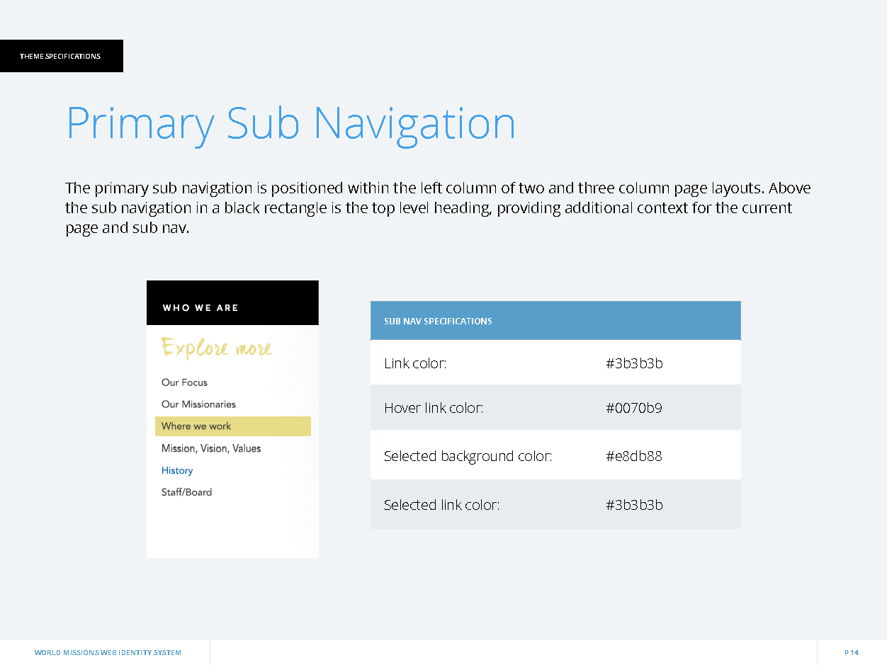
Page Layouts
Typography
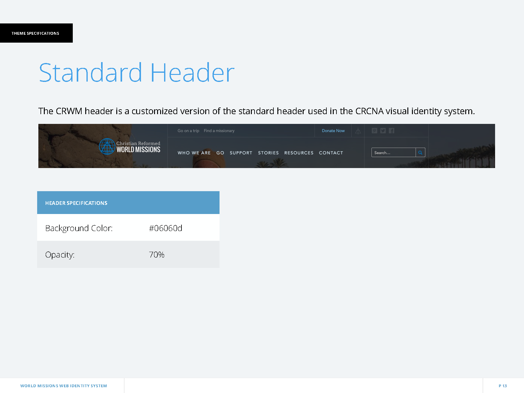
Headers
Icons
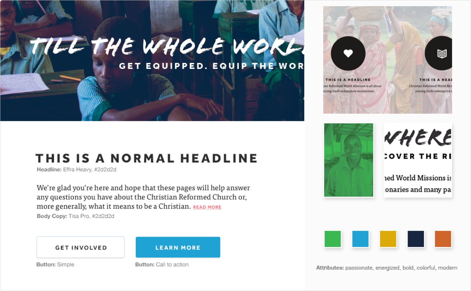
In the guide, we explained the purpose of each element and what the standard visual guide for each should be. We included visual samples of how these elements should and shouldn’t look when following the guide.
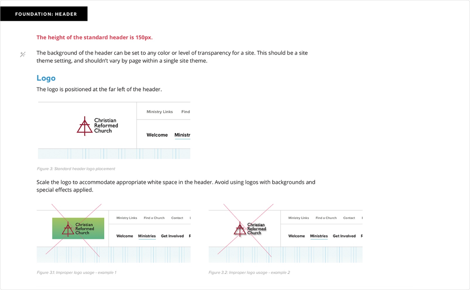

With this unified guide approved by each of the four ministries, the CRCNA now has a documented brand style they can follow for all their current and future websites. All the sites can now look unified but not uniform.
And with the individual sub-guides for each ministry, they all now had clear direction for how to create their new sites.
PROCESS: IDEATE
Style Tiles, Wireframes, and Mockups
Even after the visual standards guides were approved, we continued meeting with the clients to discuss how the guide could be implemented in each of their sites.
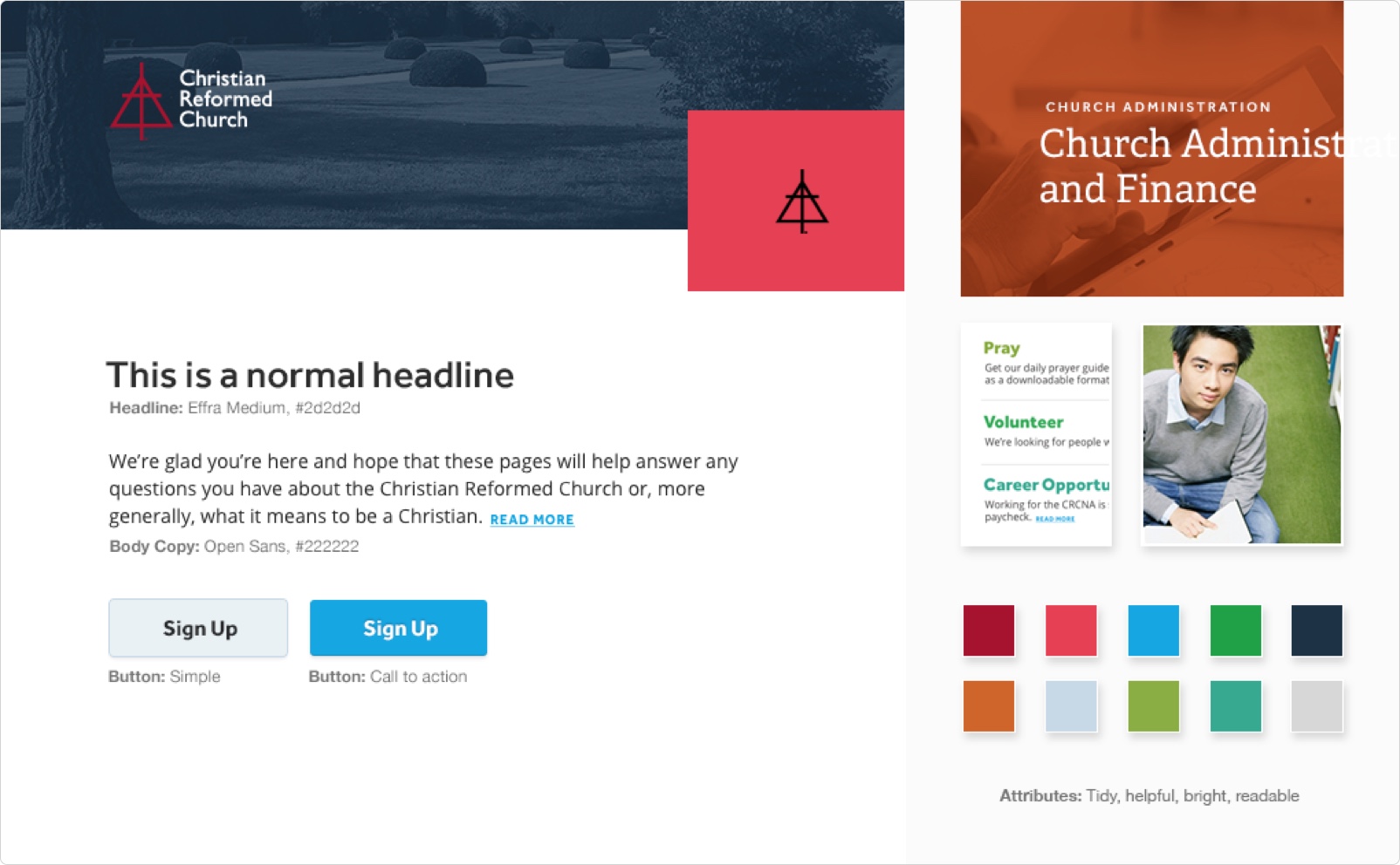
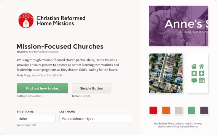
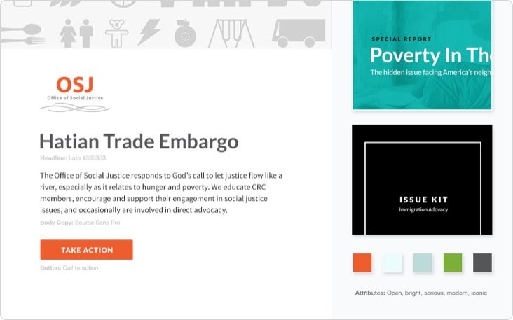
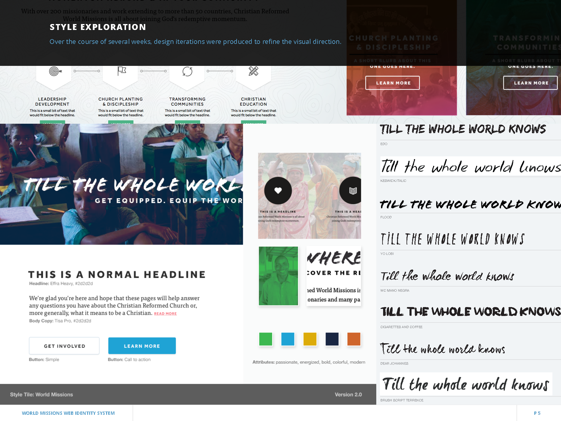
Style Tiles
We developed style tiles for each ministry, showing the important elements they should include in their site. These elements needed to remain consistent throughout their site to give it a strong design and to tie it to the other CRCNA sites.
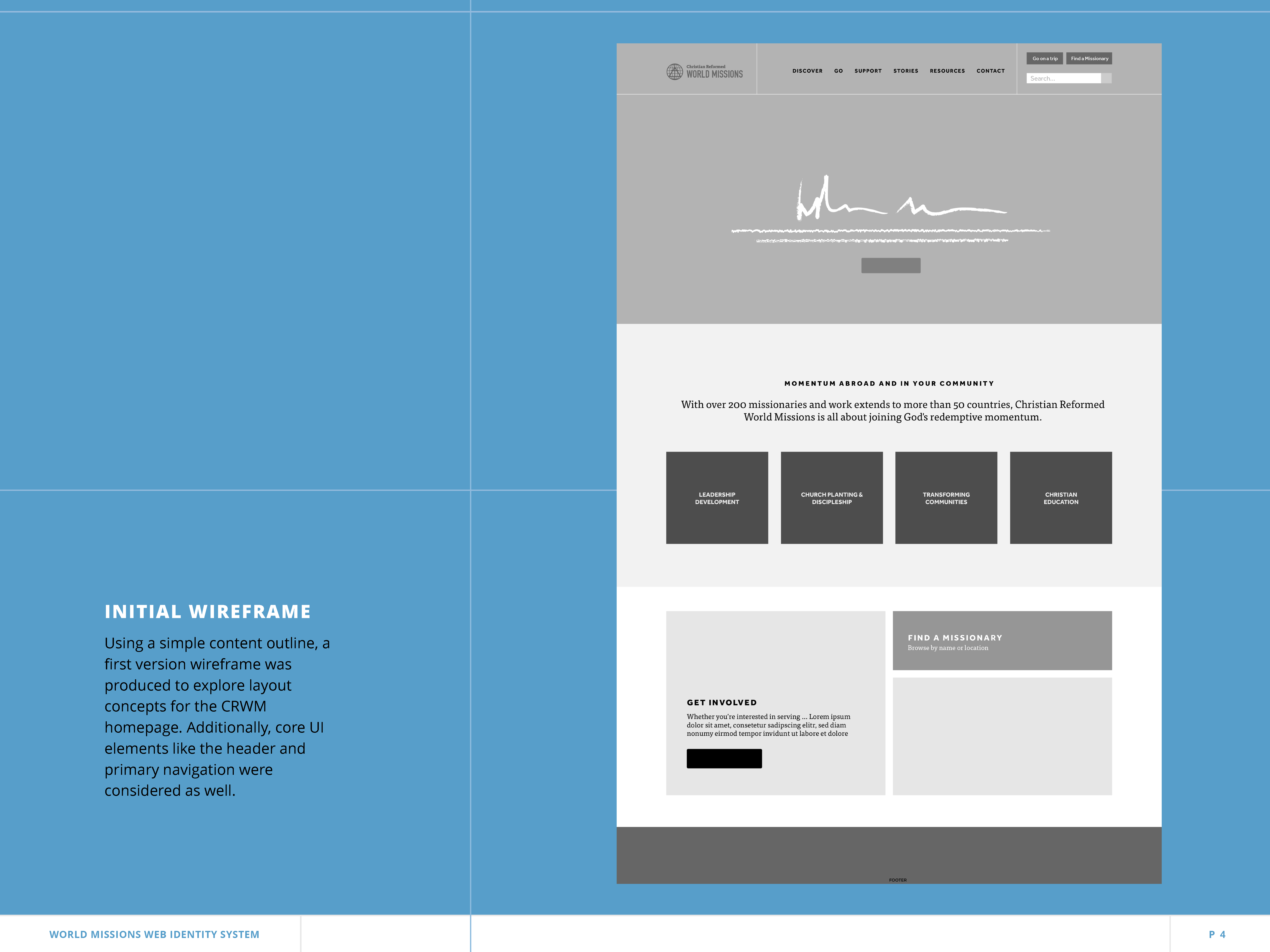
Wireframes
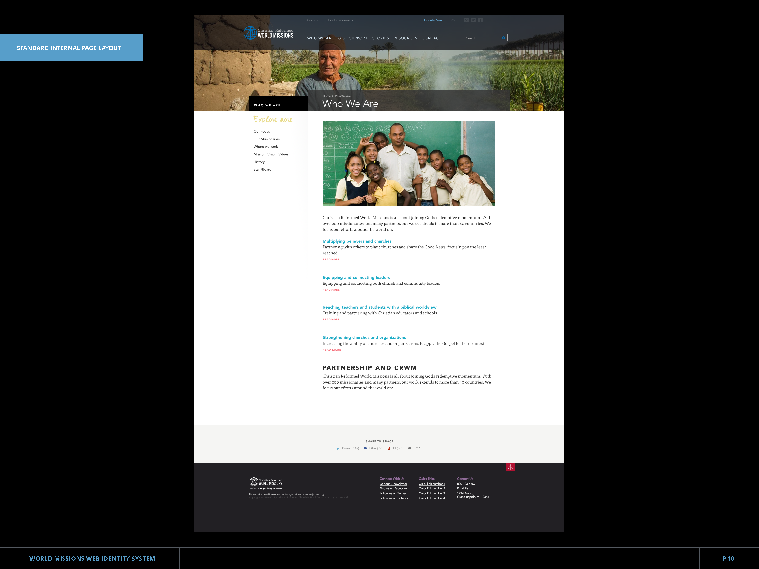
We also created a wireframe for each client’s homepage to show the different ways the standard page layout could be implemented.

Mockups
Lastly, we created 3-4 mockups for each ministry to show how some of their most common or most important pages could look when all the design elements and layouts were merged together. We needed to create 4 distinct web looks that shared one unified design.

PROCESS: IDEATE
Presenting Our Work
Presentation
Each of these ministries needed to present our work to their individual boards, so we created presentations for them showing the different stages of our work and the results.
We displayed:
User Personas
Wireframes
Style Tiles
Mock Ups
Application
Conclusion
At the end of this 10-week project, the CRCNA had a consistent brand and design language to use to tie all their sites together. They also had a solid foundation to build on when creating new sites for future ministries.
Each ministry could now go update their site, putting our design direction to good use.
Each of these ministries needed to present our work to their individual boards, so we created presentations for them showing the different stages of our work and the results.
Let’s Work Together
We helped the CRCNA with their branding & design language. And we can help you too. If you’re interested in working with us, we’d love to hear about your brand.